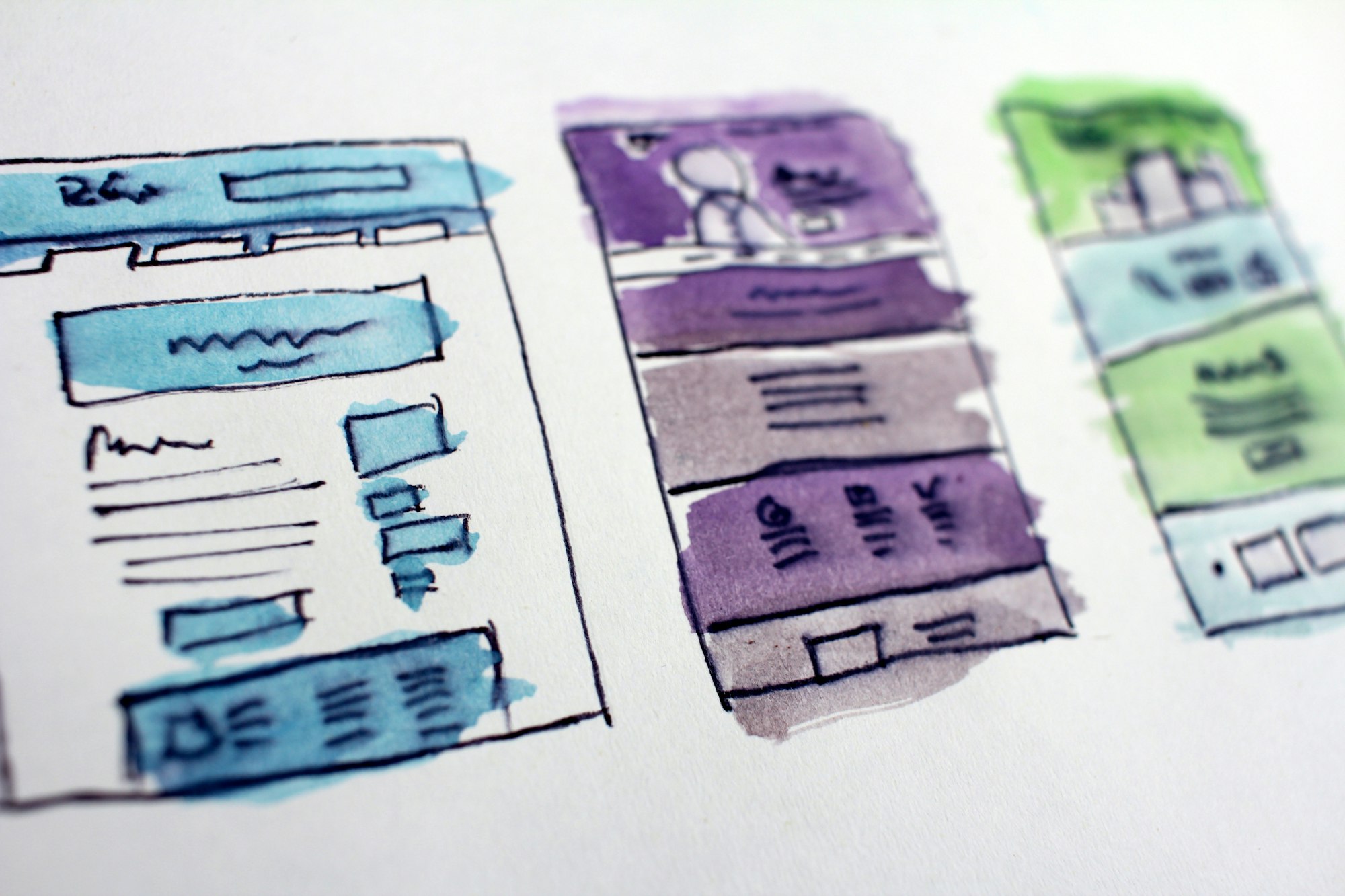
The internet is huge and old, and devices are getting smaller and more compact. Now you have to adapt your painting for a smaller canvas without losing its beauty.
This is where Responsive Design comes in. Websites can now look just as good on a phone as they do on a big-screen TV. But it wasn't always this way. It took developers years of experimentation to reach this point. And we're still making improvements each day.
In this article, we're going to dive into the history of responsive web design, and see how websites have evolved over time.
The Early Days of the Internet
Remember the early days of internet, when any website seemed great? Just getting your own page live on the web was a grand achievement. Even if it was just a Geocities page or an Angelfire page. You'd show it off to your friends. And it was one of the best feelings in the world.
The good news for designers: they knew pretty much exactly how their websites would look. Everyone was accessing the web through desktop computers with only a handful of resolutions and aspect ratios. This meant that designers could place things anywhere on the screen they wanted without worrying too much about other screen sizes.
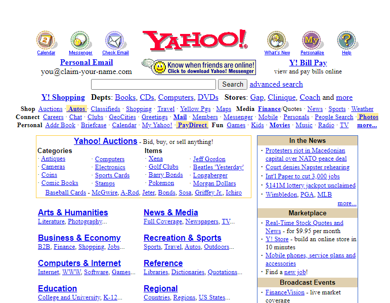 Back then, it was common to see websites that forced you to use a desktop browser. Re-designing an entire website to work on fringe screen sizes was a difficult task, and many companies didn't want to invest the effort.
Life Before CSS
For the past 20 years or so, most developers have gotten their start with web development. And that meant learning basic HTML, the basic building blocks websites.
In the most basic terms, HTML elements are rectangular boxes which stack over each other by default. There wasn't that much you could do with a few boxes containing text and images.
The most basic HTML tags were all we could use. They included h1 to h6 tags, image tags, lists, tables, paragraphs and many tags for even the most basic stuff (which are now done using CSS).
A basic HTML page would look like this:
<html> <head> <title>FreeCodeCamp</title> </head> <body> <h1>FreeCodeCamp</h1> <img src="logo.jpg" height="150" width="150" align="right"> <p>Text goes here</p> <p>Text goes here</p> </body> </html>
 There were no structured or uniform ways of styling HTML elements. But luckily, HTML gave you some customization through special tags.
All these tags even exist today, though some of them were deprecated in HTML5 because they were too basic. For example, there was a <marquee> tag, a tag for creating sliding text, images and other HTML elements.
You can achieve the same effect can now through CSS alone. But at that time, developers had to create separate tags for every single functionality. (Fun Fact: Google has an easter egg if you search "marquee tag." You get to see it in action.)
Thus, designers needed a structured way of styling elements. It needed to be flexible and completely customizable.
This led to the creation of Cascading Style Sheets (CSS), a standard way of styling HTML elements.
Cascading style sheets or CSS is a way of styling any HTML element. They have a set of pre-defined properties which can be applied to any HTML element. These style can be embedded in the same HTML page or used as an external .css file
It was a major milestone in web design. Now designers had an option to change each and every property of HTML elements and place them wherever they wanted.
When Screens Started Shrinking
Now that designers had complete control over the webpage, they had to make sure it looked good on all screen sizes.
Desktops are still popular today, but a majority of people also use hand-held mobile devices to surf the web. Now designers have less width but a more usable height, as scrolling is very convenient on touch-screen devices compared to desktops.
Websites now had to incorporate Responsive Web Design:
Responsive web design is an approach to web design that makes web pages render well on a variety of devices and window or screen sizes.
The most common way of dealing with smaller screens is a Sidebar. A sidebar is like a drawer where links and other not-so-important stuff is kept. Designers just transfer all secondary stuff to the sidebar so that the webpage looks clean.
This is an overused method, however, and sidebars weren't originally intended for this purpose.
Prior to this trend, the <frameset> and <frame> tags were very popular, as they allowed designers to embed external web pages.
But unlike the now popular <iframe> tags, these tags were highly unresponsive. This was because they didn't adapt to different screen sizes, and tried to maintain their layout even on smaller screens which looked terrible.
<frameset rows="100"> <frame src="header.html"/> <frameset cols="33%,33%,">Nested frameset <frame src="subframe1.html"/> <frame src="subframe2.html"/> <frame src="subframe3.html"/> </frameset> </frameset>
The output would look completely fine on desktops but broke on mobile devices.
 ### Transition to Responsive Design
The old, huge websites with thousands of pages were faced with a dilemma: to be responsive or not to be.
Any web designer knows that having to make a transition from a larger to a smaller screen is the worst. Your canvas is getting smaller, whereas the painting remains the same. Either you delete some parts of your painting or make it adapt.
Since there were no guidelines for being responsive back in the day, web designers often used naive ways of putting elements on various parts of the screen.
For example, using <table> tags.
Using a table tag for a layout was a bad practice for various reasons, such as:
Tables are not meant for layouts. They are for showing Tabular data in a compact form.
Table tags, just like frameset tags, are not responsive, and they don't adapt to smaller screen sizes.
The table can't be rendered until all its cells are loaded, whereas using div tags for a layout allows them to load independently.
Case Study of Some Large Websites
Let us see how some large websites dealt with this dilemma. We'll take YouTube, for example.
You have likely seen the desktop version of YouTube. It's full of stuff – a header on top, a sidebar on the left, videos stacked around each other, and a footer. Now, most of these things are quite unnecessary for mobile users as they can't utilize them properly.
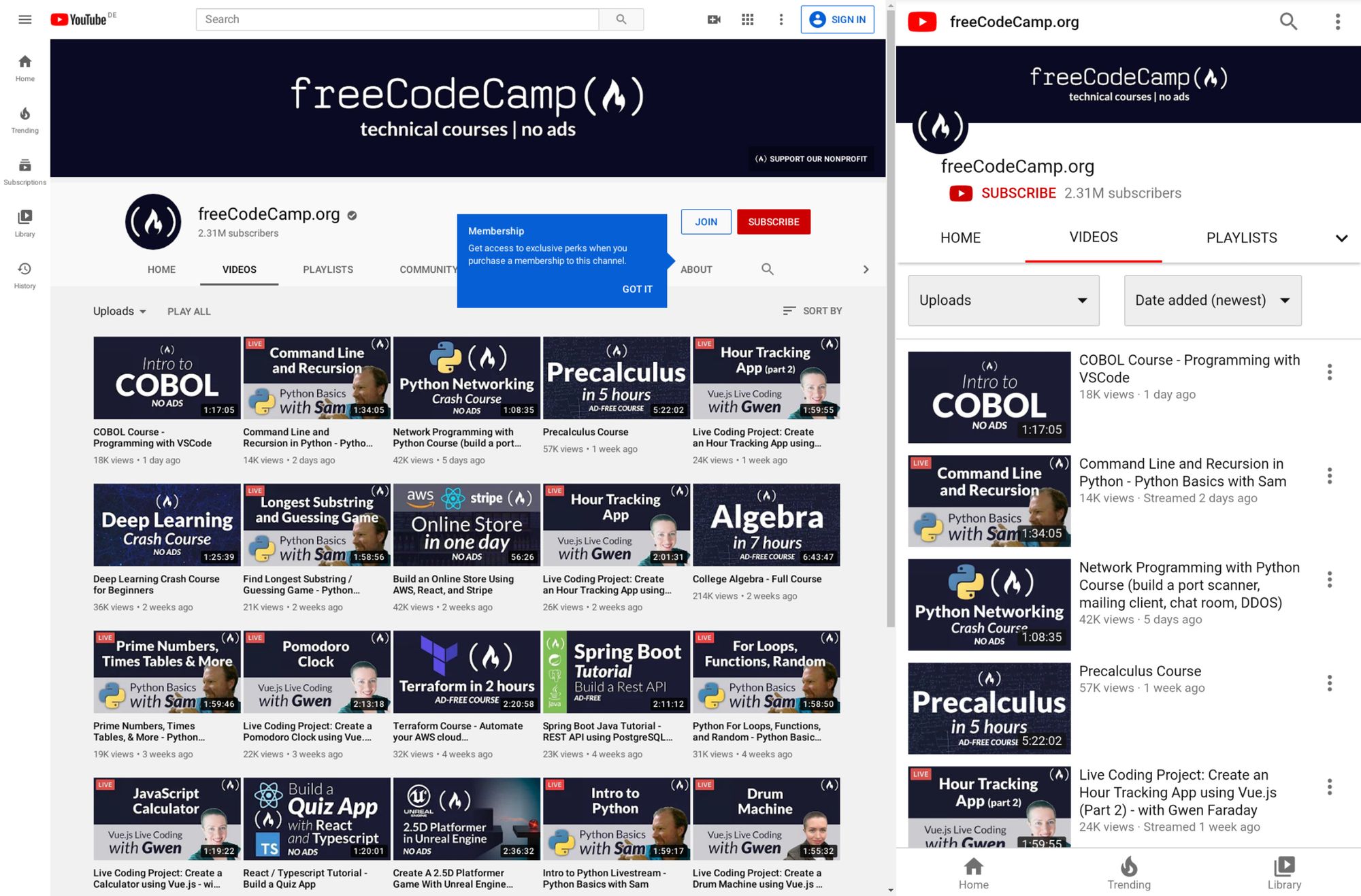 YouTube might have chosen responsive design, but that would mean hiding these extra elements somewhere.
Anyone who has designed a website knows how important website performance is. Each and every thing you put on a page slows it down. So, in YouTube's case, it would be a waste to fetch them from server only to hide them.
And YouTube is old, and so is its design. Modifying already written code has a high chance of breaking stuff that is already working. So instead, YouTube used what is known as Dynamic Serving.
Dynamic Serving is a method where the server checks whether the device requesting the webpage is a desktop or a mobile. Then it dynamically serves the webpage depending on the type of device.
This method is easy to implement, as designers don't have to deal with different screen sizes. But it's also often discouraged because if not properly configured it can devastate SEO because of duplicate content issues.
These mobile versions are often served through a different subdomain like m..com to distinguish them.
This method was used by Facebook, Wikipedia, and other huge websites, for similar reasons. Responsive Web Design is an ideal solution which is difficult to implement.
Some other sites decided to not be responsive but to build a mobile app instead. This was a reasonable approach considering that mobile apps were future proof. But installing a mobile app required some level of trust, as they had much greater access than web apps.
Also, the problem with native mobile apps was that they were expensive to make, as they had to be built for multiple platforms with the exact same design and functionality. The web is a pretty mature platform and thus has greater scope than mobile apps.
Responsive Web Design Strategy
These were the problems faced by sites which already existed. For new websites Responsive design became a must in order to compete with other websites.
Google also recently introduced mobile-first indexing which means that it prefers mobile-friendly websites in search on mobile devices, creating one more reason adapt.
Mobile-first approach
Suppose you have a suitcase with some stuff in it. would it be easier to transfer things from a smaller suitcase to a larger one, or from a larger to a smaller?
In the mobile-first approach, the website is made to be compatible with mobile first, and then see how things change when transitioning to a larger screen.
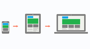 One misconception around this approach is that people think that it's mobile-only. But that's not correct – mobile-first doesn't mean designing only for mobile. It is just a safe and easy approach to start with.
Since the available space on a mobile screen is much smaller compared to a desktop, it has to be used for central content.
Also, mobile users switch pages much more frequently, so it is important to grab their attention immediately. Since there are fewer elements on the page and focus is put more on content, this results in a cleaner web page.
The Future of Web Design
The web is growing at an incredible rate. People are shifting their businesses online, and competition is stiffer than before.
There is also a discussion as to whether businesses actually need a mobile app anymore. With growth of Progressive Web Apps (PWAs) and various web API's, the web is much more powerful than before. And most native features like notifications, location, caching, and offline compatibility are now possible with PWAs.
A progressive web application is a type of application software delivered through the web, built using common web technologies including HTML, CSS and JavaScript.
The process of making a PWA is very simple, but that is beyond the scope as well as the central idea of this article. Let us focus more on what we are getting with PWAs.
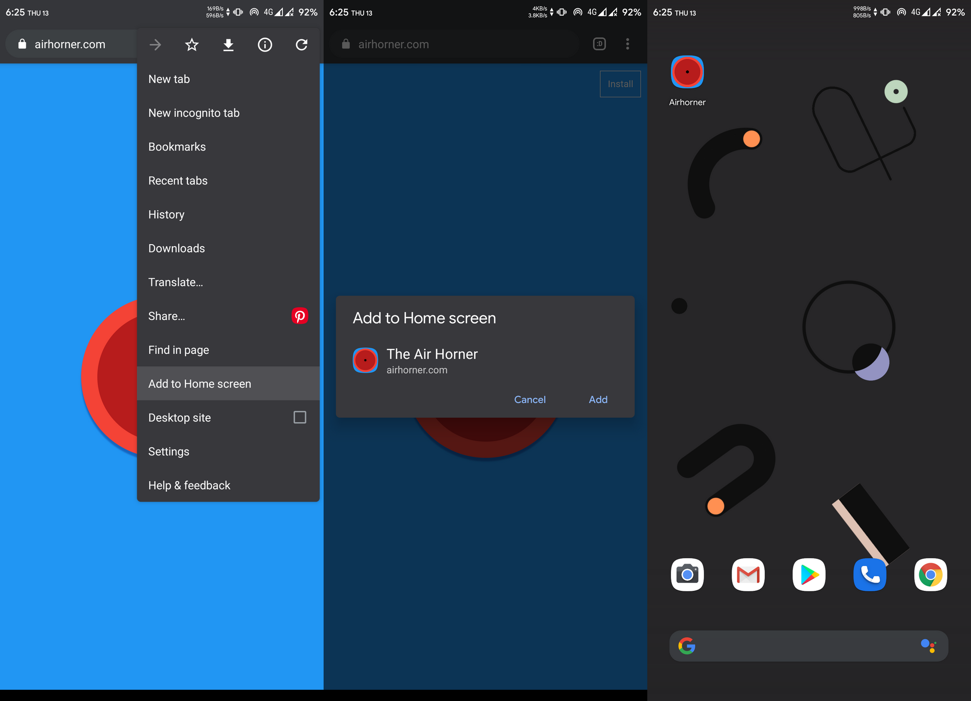 You might have noticed the "Add to Home Screen" button in the chrome browser above. For normal websites, it's nothing more than a shortcut icon on the home screen. But if the website is a PWA, you can do a lot of really cool stuff.
You don't need to install a web app for it to function as a PWA, but that makes it feel more like a native app. Also, a PWA can run as a standalone web app without the chrome address bar on top. This again gives it a more app-like feel.
PWAs work on Desktops too, which makes them a perfect candidate for any new app. They can run on any platform that has a web browser, they are safe, and they have all the basic native features.
Still, many features not already installed or available can pose a security threat, as opening a website is considered much safer than installing an app. Therefore, some highly native features still require a native app.
Just to be clear: PWAs are not a replacement for native apps. Native apps will continue to exist. PWAs are just a simpler way to achieve those features without actually building a mobile app.
Predicting the Future of the Web
As we've seen, technology continues to improve, and the internet continues to become more accessible as the number of users grows exponentially.
The shift of web design trends leans more towards performance and user experience. And will continue to do so.
We are also heading towards Web 3.0:
Web 3.0 is the next generation of Internet technology that heavily relies on the use of machine learning and artificial intelligence (AI). It aims to create more open, connected, and intelligent websites and web applications, which focus on using a machine-based understanding of data.
What this means is that everything will be connected and machines will use the internet too. It'll be similar to how web crawlers crawl websites and understand the context of the page.
A good, clean, minimal web design with more focus on content will help machines understand things better. The internet is an open place with lots of innovation. We might be heading towards a web controlled by the mind!
Conclusion
 We started from the beginning of internet and we've seen how once popular technologies became obsolete. We are still in progress toward a better internet.
We are no longer in the era where developers don't worry about users. The user experience is a priority nowadays, whether it's performance or design, a user should feel satisfied with any application.
And unlike the old days, we are not limited to any one tool. We are free to use our own creativity, and it is up to us how we transform our creations into something valuable.
The web is a wonderful place and there are many great websites to get inspired by. Let's keep our fingers crossed and keep moving forward.
Hope you liked my first article. I invite you to my internet home theabbie.github.io where I keep everything. Thank you for reading.

